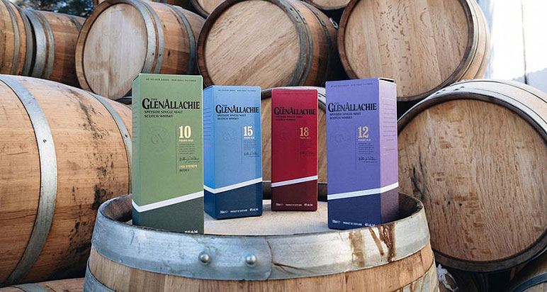
The GlenAllachie distillery has unveiled a new logo and packaging for its single malt.
The revamped visual identity is said to represent the GlenAllachie’s evolution since the first-ever core range was launched in 2018 and features slanted design elements that were inspired by the shape of the distillery’s gable end and the brand’s “upward trajectory”.
The update coincides with renewed brand messaging, underpinned by the tagline ‘whisky in good hands,’ which champions the team behind GlenAllachie.
Despite the new look, the whisky remains unchanged, with the core offering continuing to include 10-, 12-, 15- and 18-year-old bottlings.
To streamline the portfolio, the distillery’s various limited editions will now all fall under one umbrella range, The Wood Collection, with the first additions unveiled next month.
GlenAllachie Marketing Director Colette Savage said the new look brings the packaging in line with the quality inside the bottle.
She added: “A key stipulation of the project was to ensure we performed a rejuvenation rather than an overhaul. Indeed, the iconic bottle and core range colours are integral to The GlenAllachie’s brand identity and have been retained. The visual progression will aid in shaping the future of the brand as a heavy hitter in the Speyside single malt space.”
The rebrand follows the November news that GlenAllachie was successful in a Scottish Industrial Energy Transformation Fund grant application, enabling the installation of mechanical vapour recompression technology that will slash energy use in half, with the remaining demand supplied renewably by solar panels.
To further reduce its carbon footprint, the distillery has sourced all of its packaging in the UK, including uncoated paper stock, black and gold foils, and a bespoke embossed bottle.
The new-look GlenAllachie Core Collection (10-, 12-, 15- and 18-year-olds) is rolling out now. The newly packaged 30-year-old will be released next month, followed by the first Wood Collection bottlings.


